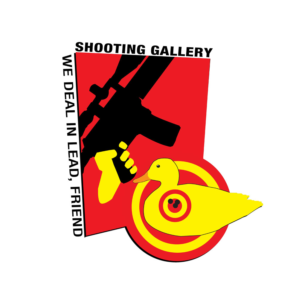
This is the first draft of some new SHOOTNG GALLERY graphix for tee shirts, stickers, posters, pins, and — perversely — a bike jersey.
It's by great TOC designer and anime fan Dave Warner, based on 1970s-vintage Third World revolutionary posters.
As they say, Viva La SG Revolution!
What'da'ya think???


13 comments:
Finger off the trigger, please. Otherwise, I like it.
Down with the Proletariat, up with the Bourgesies.
Looks great. For the little Che wannabees, I put this the way I ment it.
You use one of those to shoot a DUCK on a pond?
Seems a little drastic. Reminds me of numerous shot up moose carcass photos ....mighty hunter foot-on-the-antlers holding an assault weapon.
How about a more politically uncorrect target?
mb--back to the drawing board--you can do better--much better!! dmd45
Surrealist Art or Surrealist Comedy? Either way I like it...
Take off the scope - Real Men use iron sights!
While i understand the reference to the old revolutionary posters; I also agree that ther finger off the trigger with the gun pointed skyward might be appropriate.
Also on a graphical note. The graphic artist tries to impart a 3-dimensionality to the graphic with the edge thickness and shading but the perspective between the rectangular shape and the round SG target is off making the graphic appear "twisted". Michael, while I like the concept, I think a little bit more refinement is warranted.
Michael; I too feel the finger should be OFF the trigger. In fact It should be STRAIGHT, along side the receiver, but otherwise it looks revolutionary enough if printed many will be found on dorm room walls.
All The Best,
Frank W. James
The image depicts the rife being held upward and fired, as in Viva Revolution! Thus the finger on the trigger is appropriate.
MB, I do not however like the image. Seems too quasi-military.
I hate to say it because I like this blog and SG so much, but this ain't even close. It's either a very early concept sketch, or was created with very little knowledge of or respect for the history of typography and "graphic" design.
Or maybe this is tongue-in-cheek?
SG deserves a more refined and innovative solution.
Please take the finger off the trigger. When I turn my screen sidewise the rifle is pointed toward the guy in the neighboring cubicle and he keeps ducking under the desk. This is very very unsafe and he could be seriously hurt.
As a Graphic Artist myself, I would go for something a little less like a cartoon and a little more contemporary.
Gosh, apparently you guys slept through the "Socialist Response to Cubism" and the "Rise of Post-Modern Irony" lectures in your art history classes!
Short clarification...I'm not replacing the duck logo — which the Outdoor Channel recently now was now a valuable piece of branded property — I'm just using a series of graphix on some collateral material and probably the SHOT SHOW collectors pin, which has become my expensive little enameled albatross to bear.
Ideally, I would like to have 5 or 6 pieces that essentially highlight the established SHOOTING GALLERY duck logo. I'm asking famous Japanese animie artist Kenichi Sonata to do one and am open to contributions.
So Mick...you wanna do one? As the great Regulator William H. Bonney said, "...make ya famous!"
mb
Post a Comment